 It’s the second to last day of our 12 Days of Christmas series for 2023. That means we’re one day closer to Christmas! You have one full weekend left to wrap up your shopping and over the last several days we’ve given you suggestions for everything from books to smart home technology to tote bags and watches and even a yacht. Come back on Monday for our final list of items you may need in the coming year.
But, until then, on the eleventh day of Christmas, we give you: 11 Colors for Millwork, 10 Books to Read, Nine “Smart” Home Technology Options, Eight Pieces in Which to Invest, Seven Interior Design Blogs to Read, Six Festive Cocktails, Five Holiday Wishes, Four Tips for a Successful Renovation, Three Blogs Not to Miss, Two New Traditions, and One Room to Refresh.
Painted millwork has typically leaned to a “shade of white” for the last few decades, with a few exceptions. I can’t wait to share some bolder options that will set your home up with a fresh feeling for the new year.
Farrow & Ball, to no surprise, has some of the prettiest and most unique colors in the industry. Get ready for 11 colors to consider when looking to add new or to paint existing millwork.
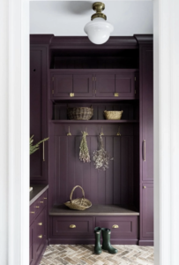 Brinjal, No. 222, A Sophisticated Aubergine
Brinjal works so well with aged brass accents and the warm earth tones shown in this bench seat and brick on the floor. I love the richness this brings into this entryway, without it feeling overwhelming.
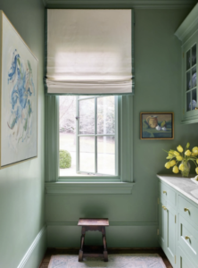 Calke Green, No. 34, A Traditional Sage Green
Calke Green is the perfect in-between shade of mint and sage. It reads brighter and is used flawlessly in this butler’s pantry. The painted-out window and trim help the color feel soft without popping against a sharp contrast color of millwork.
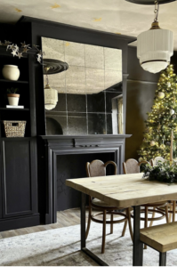 Paean Black, No. 294, A Chic Red-Based Black
Paean black is a fantastic choice for those looking for a light black. (Yes, that is a thing.) Its red tint helps bring it to life, especially against wood or other natural finishes.
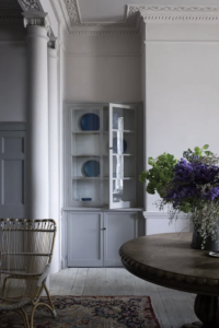 Peignoir, No. 286, A Romantic Grey Pink
Peignoir brings us back to the Victorian era with its exquisite softness and unique depth. Shown here painted from floor to ceiling, showcasing all the beautiful detail in the moldings, it creates the most beautiful backdrop for this home.
 Plummett, No. 272, A Lighter Lead
Plummett is a beautiful industrial grey hue that can be used to help bring a masculine flair to any room. It works so well to help define dramatic spaces and works well with other warmer whites and taupes.
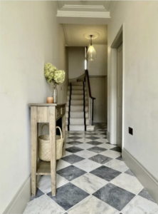 Purbeck Stone, No. 275, An Understated Stone Grey
Purbeck stone is a great alternative to “white” when it comes to molding throughout a home. It is calming and simple and ties together nicely with a large palette of colors.
 Raw Tomatillo, No. CB6, A Vibrant, Optimistic Green
Raw Tomatillo is no doubtably a bold choice for millwork, but it exudes JOY and made my list for that reason alone. I love it paired with white walls and darker woodwork, allowing it to be used in a fun way.
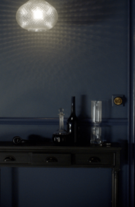 Wine Dark, No. 308, A Rich, Dark Blue
Wine dark is a moody blue that hits its prime in dimly lit areas like a study, dining room, powder room, or den. It is an intimate blue that is named after the term Homer used to describe the sea.
 Green Smoke, No. 47, A Dark and Smoky Green
Green smoke is a historical color used in the 19th century mostly on exteriors. We love seeing this color come back over the last few years and being used on millwork. Bringing the outdoors in by using this color in your home will evoke a serene feeling and a sense of familiarity.
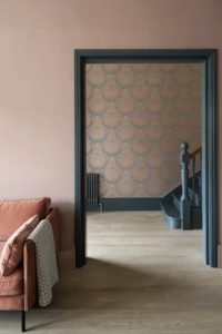 Inchyra Blue, No. 289, A Dark Blue-Grey
Inchyra blue is the perfect deep hue that will change from grey to blue to green in different lights. It is named after the classic Georgian Inchyra House where you would find the exterior doors to their famous barn this color. When paired with rose or salmon tones, such as below, it vibrantly comes to life.
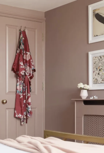 Sulking Room Pink, No. 295, A Romantic and Muted Rose
Sulking room pink is powdery and muted and elegant in its entirety. It works best when it’s paired with soft whites, charcoals, and soft greens. I encourage you to be daring with this one and consider it for furniture, a front door, or even cabinets in a bath.
2024: The Year of Bold Color
Cheers to 2024 being a year of boldness and one full of color. Let it be a year where we step out of our comfort zone and embrace gorgeous colors surrounding us in the place we spend the most time, our home.


