Spectrum Design Group

Author name: Dawn

Sun-Filled Kitchen Coffee Bar 2

Mastering the Art of Kitchen Storage Planning

Having a kitchen that is just as functional as beautiful is key to a successfully designed kitchen. Investing in the right kitchen storage is an important part of the process that is often missed. As someone who loves diving deep into kitchen design, I’m excited to share some insights on personalized kitchen storage and accessories that can elevate your cooking experience while keeping it organized and beautiful.  Embracing the Uniqueness of Your Kitchen Usage Kitchen organization is incredibly personal. Everyone uses their kitchen differently and has their own method of how things work and run smoothly in their space. Some kitchens are designed for culinary adventures, while others may be more for show. Both types require thoughtful storage solutions as a significant part of the design process.  I ask my clients to consider all the details of creating their perfect experience and space. How many people will be using the kitchen? Are there kids in the home? Are those kids self-sufficient and need easy access to help or be successful in the kitchen? Do you need to store dangerous objects that are out of reach, such as knives and breakables? Take a minute to reflect on how you and your family use the space. Are there certain tools or ingredients you reach for constantly? Do you need a baking nook or coffee bar? Would a pull-out drawer for beverages or a pot-filling faucet be a fun addition?  Knowing what you want in your dream kitchen vision is the first step toward a personalized kitchen. Mastering the Art of Kitchen Storage Planning When planning your kitchen storage, aesthetics should temporarily take a backseat to efficiency. I often remind clients that planning storage needs should be considered first and foremost, and once we develop the needs deeper, we can accommodate those into an aesthetic they love. Start by inventorying your kitchen utensils, appliances, and cookware. Ask yourself: what do I use most often? Where do I want those items to be located for easy access? For example, consider essential areas like spice storage, pots and pans arrangements, and flatware placement. A well-organized kitchen is not just a dream; it’s achievable with careful planning. One of my favorite tips is to ensure your spices are easily accessible. I can’t stress enough how frustrating it is to rummage through a cluttered cabinet while whipping up your famous curry. A well-organized spice drawer or rack not only saves time but also enhances the overall cooking experience.  Navigating High-End Kitchen Storage Customization High-end kitchen storage customization truly begins with inventory management. A kitchen clean-out is an excellent way to declutter and optimize your space. I often see clients shuffle around half-broken or unused gadgets, leading to more clutter and disorganization. By focusing on the tools that truly help you cook, we can create a beautiful storage plan. The best part about working with a designer is that we ensure your storage needs are planned from the beginning of the design concept. It’s not just about finding a place for everything; it’s about creating an intuitive and inviting space.  Dodging Common Mistakes In Kitchen Storage Selection One common mistake I see homeowners make is replicating their old designs. They often set up their new kitchens as before without fully exploring how a newly organized space could work more efficiently. Without really thinking about how an organization concept could work more efficiently or with more ease in a new space, a homeowner may miss the mark of an even better kitchen. I’ve seen this happen time and again. Instead of following old patterns, I encourage homeowners to explore new storage options. Working with a designer will help in that exploration process by sharing fresh and innovative designs and options. Be open to the possibilities. Unleashing Creativity with Functional Kitchen Accessories Let’s get creative with our kitchen accessories! One of my favorite ways to enhance organization and style is by creating a niche near the range for the most-used items—spices, oils, utensils, you name it. These niches can be decorative and an opportunity to be creative with textures and materials.  Imagine a stunning open shelf with your favorite oils and spices displayed in beautiful glass containers right at arm’s reach as you cook. This makes for easy access and adds a touch of personalized flair to your kitchen. Additionally, consider incorporating functional yet beautifully designed storage solutions. Wall-mounted racks for pots and pans can serve as both practical storage and an eye-catching display. Adding decorative elements throughout the space that also create functional storage solutions, such as fruit baskets or bowls, utensil holders, and even towel racks and hooks, will help tie the space together. Kitchen Accessories Allow for Personalization  Personalizing your kitchen is not just about adding the latest gadgets on the market; it’s about creating a space that truly reflects who you are and how you live. You can create a perfectly tailored kitchen by embracing your unique cooking habits and needs, planning for efficiency, and dodging common mistakes. Have you been considering how you can make your kitchen more functional for you and your family? A kitchen renovation isn’t just for those with outdated spaces (we can help with that, too), but it should be considered when your kitchen feels like it is not serving you and your lifestyle. I would love to work together to create your dream kitchen!

Bathroom Paint Colors

Expert Tips on Choosing the Perfect Bathroom Paint Colors

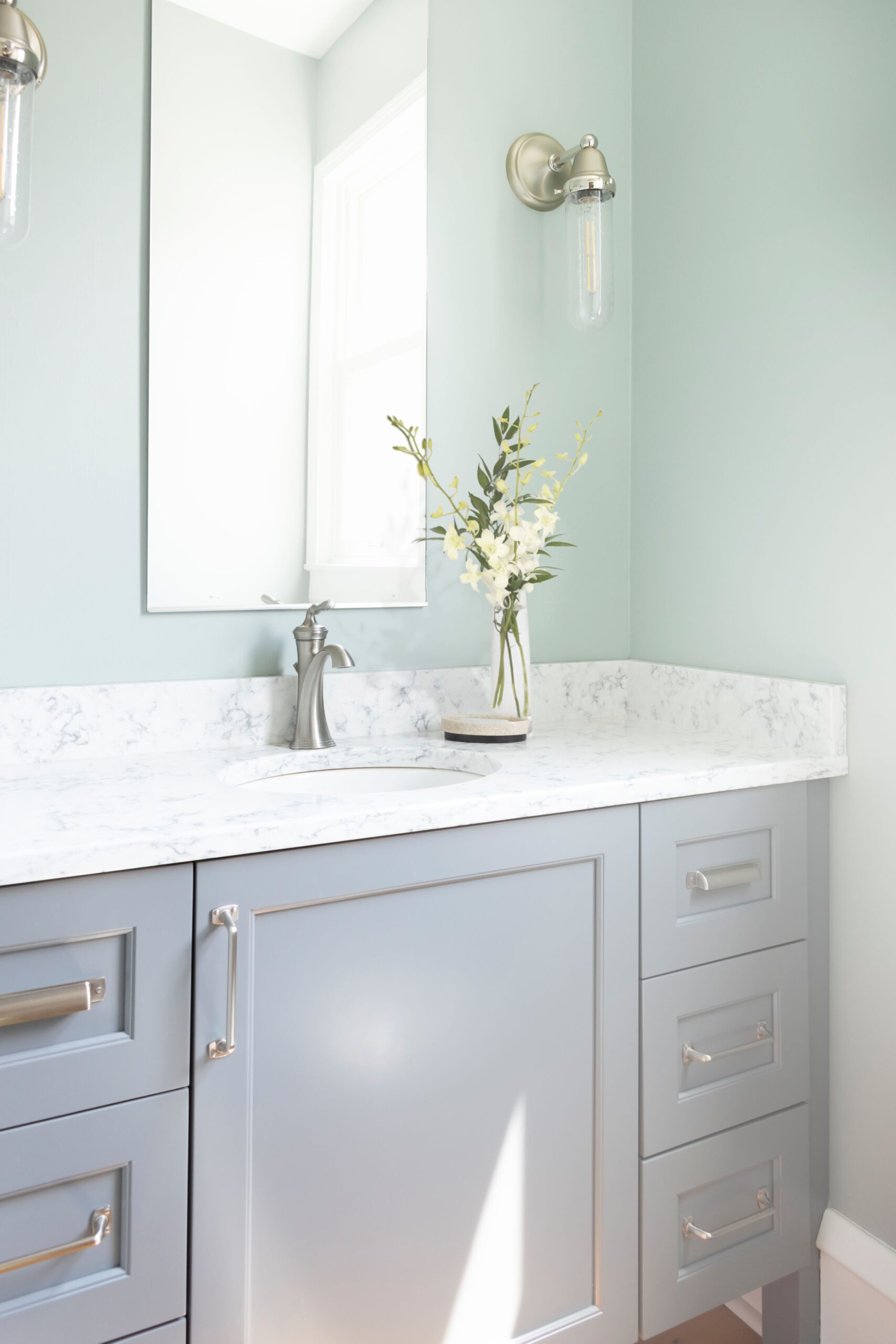
Transforming your bathroom doesn’t always mean tearing down walls and replacing tile; sometimes, a fresh coat of paint is all it takes to give the space a brand, new look and help satisfy your itch. With help from someone like me, who loves colors and takes a thoughtful approach, you can select the right bathroom paint colors to reflect your current style. To help guide you through this process, I’ll walk you through color selection to ensure that your bathroom paint choices enhance aesthetics and complement the other elements in your bathroom. The Designer’s Approach to Bathroom Paint As designers, we help our clients select colors with curated options that align with their style and the bathroom’s overall design.  We consider various factors, including the home’s architecture, the desired atmosphere, and the other finishes that will be included. This collaborative approach ensures that the chosen colors enhance the space rather than compete or clash with surrounding finishes. Process for Selecting the Right Bathroom Paint Colors Selecting the right bathroom paint color typically begins after considering the other finishes. I personally like to choose the paint color at the end of the specification process or as I am pulling the concept together. This means deciding on the flooring, cabinetry, millwork, wall tiles, and countertops first. And, if they’re already in place, pulling together some options that match those things, so to speak. Following this structured approach minimizes the risk of the chosen color appearing different from the vision.  There have been instances when a client will come back realizing that a gray they chose looks more blue than intended or a white is leaning more yellow.  This is where it is really helpful to work with a designer. Importance of Daylight in Color Selection If your space has windows, it is important to see how natural light interacts with a paint color throughout the day. Bathroom paint colors can appear vastly different under varying lighting, from bright daylight to soft, artificial light, and even nighttime.  Paint a sample of your chosen color in the bathroom to see how it looks at different times of day. This will help you figure out what will work best.  If you are working with a designer, they can provide large sample sheets to hold up, so you don’t need to paint a sample on the wall. Creating a Cohesive Look Consider how the bathroom paint color interacts with the existing fixtures to create a cohesive look.  For example, if you have a dark countertop, a lighter paint color can create a striking contrast, enhancing the overall design.  Conversely, a slightly darker or complementary color can provide depth and warmth. The Magic of Shoji White One color I like to use is Shoji White by Sherwin-Williams. This neutral paint color is warm and inviting while maintaining the desired brightness in a bathroom.  It is a warm greige that brings a welcoming creamy tone to bathrooms. It works beautifully by contrasting with white or wood millwork, bringing warmth to the bathroom while keeping it light and fresh. However, it may not work in your bathroom, so follow the other tips I’ve provided as you consider this and other colors.  Transform Your Bathroom Overnight With the right paint colors, you can change the look of your bathroom overnight. You can create a fresh, luxurious, and uniquely yours space with careful consideration and professional guidance. Trusting the expertise of professionals can help you navigate the complexities of color selection, ensuring that your choices enhance your home’s overall aesthetic and functionality. If you want to explore your options with expert advice, don’t hesitate to contact us. I’d love to help you create a bathroom that reflects your style.

SW 2025 Colors Sneak Peek

A Look Ahead – 2025 Colors

Storytelling through color is one of my favorite parts of design. The other day, a seminar hosted by Sherwin Williams reminded me how each year the palettes showcased are knit together by stories, experiences, art, tradition, and even current events. So much thought and creativity go into selecting colors every year that are not only aesthetically pleasing to the eye, but also truly help tell the story of each space. Here’s a peek at Sherwin Williams 2025 Colormix Forecast with two of their capsules. Chrysalis “The colors of chrysalis are reminiscent of a slow-growing forest, the timeless stories of nature contained within its grain, and the generations of precious memories made upon hand-hewn hardwood floors.” “With color that inspires a thoughtful, deliberate pace of living, we align our intuition, find a touch of poetry in everyday things, and engage instinctively with our surroundings and our experiences”. Paradox “Unexpected elements in print, pattern, and perspective ignite the interest of an interior and push the boundaries of inventiveness to establish surreal engagement in both residential and commercial design.” “Paradox fuses youthful whimsy and time-honored design principles to dissolve expectations about color, style, and the status quo.” I love to see a shift to bright, unexpected colors used in new ways. As an industry, we are learning more and more about neuroaesthetics which shows that our brains crave sensory information. Our bodies respond to their environment without actual awareness of doing so. Our aesthetic experiences have the power to reshape our physiological, neurological, and biological systems ultimately creating responses that positively improve our mental and physical well-being. Did you know viewing art for 20 minutes a day can be as beneficial as getting a good night’s rest? It can even reduce our cortisol levels, the stress hormone. I hope you move into 2025 with a new vision of how you will incorporate color into your day-to-day life and the spaces that surround you.

A Homeowners Guide to the Artistry of Zellige Tiles

A Homeowner’s Guide to the Artistry of Zellige Tiles

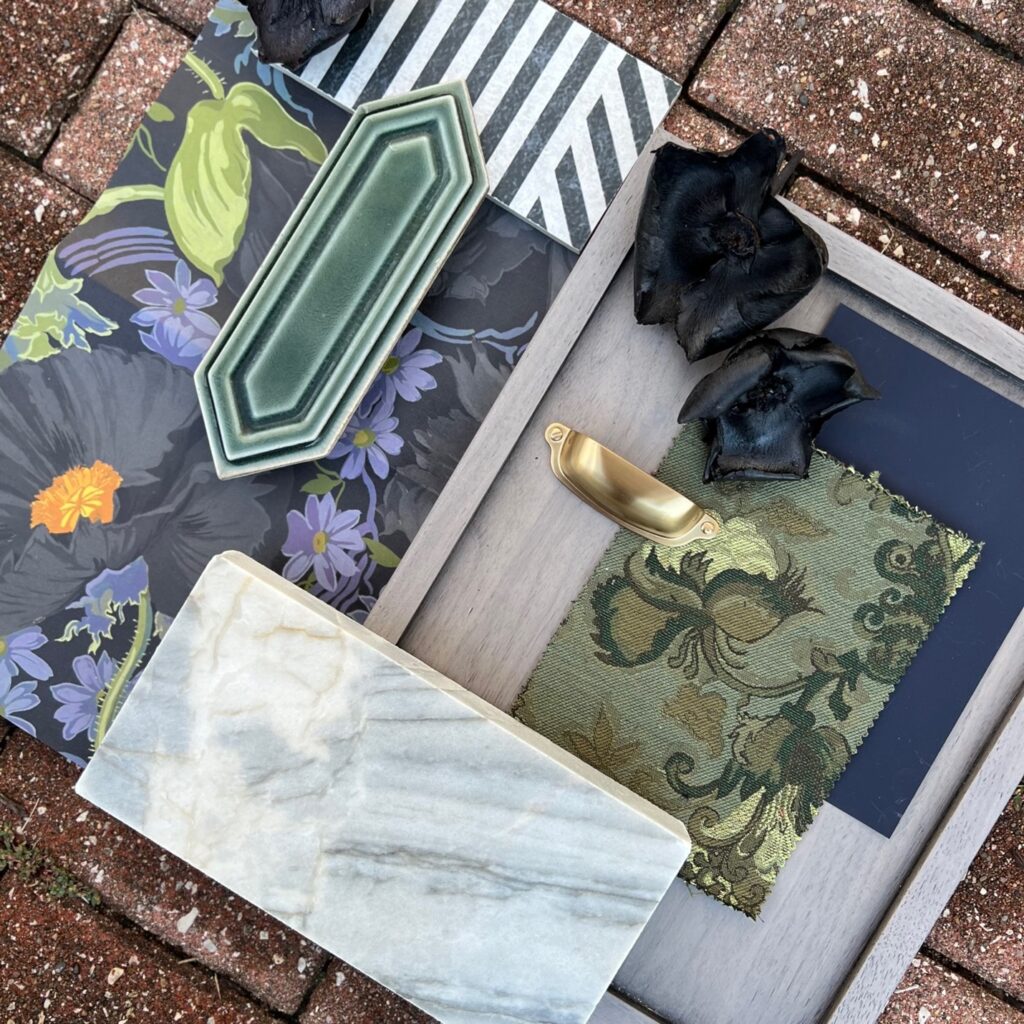
Zellige tiles have recently emerged as a captivating choice for homeowners looking to add a touch of artisanal charm and timeless beauty to their spaces.  These unique tiles, rooted in centuries-old craftsmanship, offer a distinctive allure that sets them apart from traditional ceramic tiles and terracotta.  If you’re considering Zellige tiles for your home, it’s essential to understand their characteristics, maintenance requirements, cost considerations, and why they’re both trendy and classic in the design world. What are Zellige Tiles? Zellige tiles are handmade, glazed terracotta tiles crafted using traditional Moroccan techniques. They are known for their irregular shapes, vibrant colors, and unique glaze variations, creating a mesmerizing surface.  Each tile is individually hand-cut, glazed, and fired in wood-fired kilns, resulting in slight imperfections that enhance their artisanal appeal. They are celebrated for their ability to add texture, depth, and a sense of craftsmanship to any interior or exterior space. Zellige vs. Ceramic vs. Terracotta Tiles While both Zellige and ceramic tiles are made from clay, their manufacturing process and aesthetic qualities differ significantly.  Ceramic tiles are typically mass-produced using molds and machinery, resulting in uniform shapes and sizes. Terracotta tiles, like Zellige, are also made from clay but undergo a different firing and finishing process. They are typically left unglazed or finished with a matte sealant, emphasizing their earthy, rustic appearance.  In contrast, Zellige tiles are entirely handmade, giving each tile a unique character with variations in size, shape, and color. The glazing process also differs, highlighting a glossy, translucent finish and the natural imperfections and variations inherent in handmade products. Maintenance of Zellige Tiles One common question among homeowners considering Zellige tiles is their maintenance requirements. Due to their handmade nature and glossy glaze, Zellige tiles can be more prone to chipping and scratching than ceramic tiles. However, proper installation and regular sealing can help mitigate these issues and preserve the tiles’ beauty over time.  Routine cleaning with a mild detergent and soft cloth is recommended to maintain their luster without damaging the delicate glaze. So their upkeep isn’t any worse than anything else in your home. Cost Considerations The cost of Zellige tiles can vary depending on factors such as size, color, and finish. However, Zellige tiles are generally considered a premium option due to their artisanal craftsmanship and unique aesthetic appeal.  Prices typically range from moderate to high, reflecting the labor-intensive nature of their production and the demand for handmade, bespoke materials in interior design.  However, we often use Zellige porcelain or ceramic tile in our clients’ homes. These have the same effects as traditional handmade products but are thinner and more cost-effective. Plus, they require no maintenance! Trendy Yet Timeless Appeal Zellige tiles have gained popularity recently for their ability to add warmth, character, and a touch of exoticism to modern interiors. Their handmade quality and imperfect beauty resonate with the trend towards artisanal craftsmanship and personalized design.  Despite their trendy status, Zellige tiles also possess a timeless quality rooted in the centuries-old Moroccan tradition, making them a versatile choice that complements contemporary and traditional decor styles. The Untold Story of Zellige Tiles Beyond their aesthetic appeal and cultural heritage, Zellige tiles embody deeper craftsmanship, sustainability, and cultural exchange narrative. Each tile carries the imprint of skilled artisans who have preserved and perfected their craft over generations.  We have also used decorative tiles from other countries for certain rooms in clients’ homes, such as the bathroom or kitchen. They are a fun accent that can bring back memories of a fun holiday or travel abroad.  Beyond mere decoration, Zellige tiles invite homeowners to embrace the beauty of imperfection, celebrating the human touch in an increasingly mechanized world.

Energy Bites

Dawn’s Energy Bites

If you’re a parent, you’re probably all too familiar with the ‘I’m hungry! There’s nothing to eat!’ chorus that fills the house, especially during summer break. That’s why I love having these Energy Bites on hand. They’re not just a ‘treat’ but a nutritional powerhouse. Packed with protein and nutritious seeds, they’re a great way to boost energy. I stash a few in my work bag for a quick and satisfying mid-morning or afternoon snack. Energy Bite Ingredients: 1 cup pure creamy peanut butter {look for the type without sugar or added oil} 1/4 cup raw honey 1 tsp vanilla extract 1 1/4 cup old-fashioned rolled oats 3 tbsp chia seeds 1/4 cup pumpkin seeds 3/4 cup chocolate chips {mini work best} 1/4 tsp sea salt Optional ingredients: Shredded coconut Chocolate candies {UNREAL chocolate gems or M&Ms} Flax seeds Hemp hearts Directions: Mix all ingredients with a wooden spoon or mixer, then refrigerate the dough for about 20 minutes until set. Roll the dough into golf-ball-sized balls. We keep ours in the refrigerator to keep them fresh. I typically double this recipe because we go through them fast! Enjoy!  Check out some of our other recipes.

Bring Outdoors In

7 Ways to Bring the Outdoors Inside Your Home

Finding ways to reconnect with nature within our living spaces is good for our homes, minds, and bodies. Incorporating elements that bring the outdoors in can significantly enhance the ambiance and livability of your home.  From strategic use of wallpaper and plant placement to harnessing natural light and integrating indoor-outdoor living, here are effective strategies to create a harmonious and rejuvenating indoor environment inspired by nature. Wallpaper that Mimics Natural Elements Wallpaper is a versatile tool for transforming interior spaces. Choosing designs that mimic natural elements can instantly evoke a sense of the outdoors—and it’s not the wallpaper your grandmother used to use. Your choices are vast, from sticker paper to easy-to-apply (and remove) wallpaper.  One of my favorite textures is grasscloth, which you can find in peel-and-stick or wallpaper. It’s a versatile option that adds texture and depth to your walls.   Grasscloth is best used in dry spaces with low traffic, such as bedrooms, living rooms, dining rooms, and studies. It can also be used in powder rooms, dens, or home offices. However, grasscloth is delicate and porous, so it should be avoided in areas with high humidity, like bathrooms, or high-traffic areas, like hallways. If you don’t want to go with grasscloth, consider wallpapers with botanical prints, serene landscapes, or textures like stone and wood grains. These designs add visual interest and create a calming atmosphere reminiscent of natural environments.  A more modern way to use wallpaper is to “drench” the room, which means applying it wall-to-wall rather than on a feature wall. You can also paint the millwork a natural tone to blend in with the wallpaper for an added “wow” experience.  Any of these options will make your home feel like an extension of an outdoor oasis. Harnessing the Power of Plants Plants are nature’s decor, bringing life, color, and oxygen into our homes. Strategically placing houseplants throughout your space can refresh the air and create a vibrant indoor garden atmosphere.  My favorite plant to bring indoors is a ZZ plant—or Zamioculcas zamiifolia. Place a ZZ plant in bright, indirect light. If your windows face south, east, or west, avoid placing the plant in direct sun because the leaves can easily burn or scorch. In north-facing homes, you can put it almost anywhere. It will thrive indoors, clean the air, and add a fun texture.  If a ZZ plant isn’t your jam, consider large leafy plants like fiddle leaf figs or palms to add height and drama, while trailing plants such as pothos or spider plants can soften corners and shelves. Succulents and cacti thrive in sunny windowsills, bringing a touch of desert charm indoors.  Incorporating plants enhances aesthetic appeal and promotes well-being by reducing stress and boosting mood. Choosing Calming Color Palettes Color palettes inspired by nature’s hues can transform your home into a serene retreat.  Light-colored walls, such as cream or white, can be used as a backdrop in the home, providing a canvas to bring the outdoors in. Earth tones like warm browns, soft greens, and sandy neutrals evoke a sense of grounding and tranquility. Blue shades reminiscent of the sky and ocean promote relaxation, while sunny yellows and oranges add warmth and energy.  Integrate these colors into your walls, furniture, and decor to create a cohesive, soothing environment that mirrors the natural world outside your windows. Maximizing Natural Light with Well-Placed Windows Natural light is aesthetically pleasing and essential for our health and well-being. Maximize the natural light entering your home by strategically placing windows to capture sunlight throughout the day.  Consider installing larger windows or adding skylights to flood rooms with natural daylight, reducing the need for artificial lighting and enhancing the connection to outdoor vistas. Sheer curtains or blinds can filter light gently, creating a soft ambiance while maintaining privacy. Lighting that Follows Circadian Rhythms Lighting design is crucial in mimicking natural daylight indoors, supporting our circadian rhythms, and promoting a healthy sleep-wake cycle. Invest in lighting fixtures with adjustable color temperatures that mimic sunrise and sunset’s warm hues. Programmable smart lighting systems allow you to automate light intensity and color throughout the day, syncing with your body’s natural rhythms.  This holistic approach to lighting enhances comfort and improves productivity and overall well-being. Integrating Indoor-Outdoor Living Spaces Extend your living space beyond four walls by seamlessly integrating indoor and outdoor areas. Sliding glass or folding patio doors can blur the boundaries between your interior and exterior spaces, creating a cohesive flow and enhancing natural ventilation.  Consider extending your living area onto a patio or balcony with comfortable outdoor furniture, potted plants, and ambient lighting.  During spring and summer, open doors and windows to invite fresh air and natural sounds indoors, fostering a connection with nature. Using Window Curtains Use window curtains strategically to create a sense of continuity between indoor and outdoor spaces. Floor-to-ceiling curtains in lightweight fabrics like linen or sheer materials can frame windows and doorways, creating a seamless transition between indoor comfort and outdoor views. Shades in natural materials work great in less formal areas, like sun porches, all-season rooms, and even some kitchens. Use shades made of  bamboo, jute, rattan, or natural grasses Opt for curtain designs that complement your interior decor while allowing natural light to filter through, enhancing the sense of openness and connection with nature. Bring the Outdoors In You can create a sanctuary that embraces the beauty and tranquility of the natural world if you bring the outdoors in.  Whether through wallpaper that evokes outdoor landscapes, lush greenery that purifies the air, or lighting that mirrors natural daylight, each element contributes to a harmonious indoor environment that promotes well-being and serenity.  Embrace the opportunity to bring the outdoors in and transform your living space into a retreat that rejuvenates mind and body.

Harnessing the Power of Sunlight In Your Home

Harnessing the Power of Sunlight In Your Home

One of the best parts about living in the Midwest is experiencing the seasons. Every season brings something special, but through all of them, there is one constant thing that brings me instant joy: sunshine.  Seeing and experiencing the sun streaming into my home has the power to change my mood, my physical being, my motivation, and even my creativity.  During the winter months, I experience a negative change in my productivity and overall family dynamic.  Lack of sunlight is a harsh reality for a large part of the year, but what if there were ways to strategically design your home to attract sunlight and reap all the benefits year-round?  The design world has tried to mimic natural light through LED lighting for years, and although that is beneficial, it cannot compete with the real deal.  Function is always the most important part of my job, and how our minds and bodies function when in a space is equally as important as how space flows. The Power of Sunlight Sunlight produces serotonin, the happy hormone that improves mood. It can alleviate pain and give us energy. Sunlight also produces endorphins, the feel-good hormone. Sunlight is known to boost the immune system because of the power of vitamin D and its crucial role in cell function. Vitamin D from the sun also influences our bones, cardiovascular system, hormones, and brain function.  I can go on for days about why the sun benefits our bodies, yet Americans spend most of their time indoors. Studies show we spend around 90% of our time inside the four walls at home or work. Not only does this affect our moods, but our circadian rhythm changes when we live and work under artificial light.  As an interior designer, I would love to help bridge that gap and maximize natural light indoors as much as possible to help combat some common mental and physical problems we see in our modern, busy lives.  So, how do we bring the outdoors in?  Natural Light In Your Home Consider how natural light can be as important as colors or aesthetics if planning a major home renovation. We live in a Pinterest world where we can pin a kitchen we love and hope to recreate it in our homes.  One of the biggest problems with this is, structurally, every house is different. So many of the Pinterest dream spaces are abundant with natural light that your home may not offer in its current state.  Working with a designer will help you see if modifying the existing windows or adding some is an option when redesigning your home. Another large factor in making this change is considering the exterior of your home and visually determining how it will look from the outside by changing the glazing.  When renovating, one of our goals is for the new space to seamlessly flow with the rest of the home, which appears to be in its true form. Sometimes the opportunity presents itself to move a space across the home that better suits the function.  For instance, moving a kitchen to the back of the house, settling near a row of windows, and flopping the living room to the home’s central area where the kitchen once was. Intentionality when renovating is key to using the space in new ways within the existing structure.  Maximize Natural Light In Your Home Bringing natural light into your space doesn’t have to be an expensive project. Playing with light through accessories is an easy and budget-friendly way to add sunlight without breaking down walls or moving around rooms.  Placing mirrors along hallways and on walls across from windows or doors will allow for the rays to bounce around the home and visually create a brighter and seemingly larger space.  We even saw disco balls added to high-end homes as décor in the last few years. This wasn’t because people loved throwing dance parties but because the light bounced around their space, instantly creating happiness and playful energy throughout the home.  Crystals are an easy accessory to add to plants or windows to give the same effect on a smaller scale.  When considering paint colors, lighter spaces will allow more bounce from the sunlight, and keeping the ceiling white can also help reflect the light.  When considering window coverings, I love layering and having options for opacity. Blocking out harsh rays while working or doing a task but allowing the glow and warmth from the sunlight can benefit your creativity and productivity at work.  From experience, I learned that working under cool light without windows was detrimental to my health. I am so grateful for the window over my desk, which welcomes me every morning with sunshine (or at least as much as the Midwest allows).  Furthermore, if you can open the windows, you will reap the benefits of vitamin D exposure and the fresh air we all need.  It seems like a no-brainer, but we often do not take the time to do this. I encourage you to set up a home office near a patio door or even on the deck; it is a great way to start off your workdays.  Use Natural Light to Find Joy  Sitting in my living room in my favorite corner of my home, I am grateful for another Spring and the opportunity to work in the natural light.  When our 14-year-old dog passed away a few weeks ago, my youngest son asked if we could transform Jack’s corner into a little space where we could remember him. Like most dogs, he had the best spot in the house where the sun blazed most of the day, allowing for a peaceful rest.  As a designer, I quickly started researching to find a comfortable and stylish chair (of course) that, more importantly, would fit both my kids simultaneously.  My morning quiet time in this chair has been more healing than anything else. Every morning since, I’ve watched the sun come up over our fence

2024 On-Trend Colors

Color Trends 2024: Elevate Your Home with the Hottest Hues

As we embrace a new year, it’s time to give your home a fresh and stylish makeover. In 2024, color trends are set to bring vibrant, sophisticated, and soothing hues into our living spaces. Let’s look at the colors that will dominate interior design, offer insights on incorporating them into your home, share which trends to ignore, and provide tips on elevating your living space for the coming year. Embracing the Hottest Hues of 2024 Let’s begin by unveiling the colors that are poised to make a statement in interior design: Serene Blues: In 2024, shades of blue will dominate the color palette. From calming aquas to deep navy blues, these versatile hues evoke tranquility and sophistication. Consider using them in bedrooms, bathrooms, or as accents in living areas. Earthy Greens: As we continue to prioritize sustainability, earthy greens will take center stage. Mossy greens, olive tones, and rich forest greens bring a connection to nature into your home. Use them in furniture and decor and consider using them in hallways or bedrooms (ceiling included) to help bring in an organic, intimate feel. Warm Terracotta: Terracotta, with its warm and earthy undertones, is back (Editor’s Note: Dawn talked about terracotta making a comeback in our 2021 Q3 newsletter. If you want to know what’s coming in the design world, you need to subscribe to our Quarterly Newsletter). Incorporate this color into your home through tiles, pottery, and textiles. It’s perfect for adding a cozy Mediterranean vibe to your space. Neutral Neutrals: While bold colors are rising, neutral tones like soft grays, warm beiges, and classic whites remain popular. These shades create a timeless backdrop that allows you to experiment with other vibrant hues. Muted Pastels: Soft pastels like blush pink, dusty lavender, and muted peach continue to charm homeowners. Use them in upholstery, bedding, and accessories for a touch of whimsy and sophistication. Incorporating Trendy Colors into Your Home Now that we’ve identified the on-trend colors for 2024, let’s discuss how to incorporate them into your living spaces seamlessly: Accent Walls: Create a focal point in your room by painting an accent wall in one of the current colors. This can instantly transform the space and make it feel updated. Keep in mind, that accent walls nowadays are not only painted, but also created with wallpaper or moldings, wood patterns, and dimensional grids with trendy colors and/or patterns. Furniture and Upholstery: Invest in furniture pieces or upholstery in an updated color. A vibrant sofa or a colorful set of dining chairs can breathe new life into a room. Accessories and Decor: Decorative elements like throw pillows, rugs, artwork, and vases are perfect for introducing trendy colors without committing to a full redesign. Kitchen and Bathroom: Consider updating kitchen cabinets or bathroom tiles with on-trend colors. These spaces are often smaller and can handle bolder color choices. Trim and Molding: Don’t forget about the details. Painting trim, moldings, or doors in trendy colors can add a subtle yet practical touch to your interior. What Color Trends to Ignore in 2024 While staying current is essential in keeping your home fresh, not every color trend will suit your style or space. Here are a few trends to consider ignoring: Overly Bright Colors: Extremely bold and vibrant colors can overwhelm a space. Instead, opt for muted or toned-down versions of bright hues. Monochromatic Schemes: While monochromatic color schemes can be chic, they can also become monotonous. Feel free to mix in contrasting colors to create depth and interest. Short-Term Fads: Avoid chasing fleeting color fads that might quickly become outdated. Focus on timeless choices that will stand the test of time. Elevating Your Home in 2024 In addition to updating your color scheme, here are some tips to enhance your home in the coming year: Sustainable Design: Embrace sustainable and eco-friendly design elements. Choose furniture and materials that align with your commitment to environmental responsibility. Biophilic Design: Bring the outside in by using indoor plants as decorative elements. Adding dried or fresh flowers in vases throughout the home can also be a great way to add pops of color and texture. Smart Home Integration: Invest in smart home technology that enhances convenience and efficiency. Smart lighting, thermostats, and security systems can elevate your living experience. Comfort-Centric Design: Prioritize comfort in your home. Invest in plush seating, cozy textiles, and ergonomic furniture to create a comfortable and inviting atmosphere. Personalized Spaces: Tailor your home to reflect your personality and lifestyle. Incorporate personal touches, family heirlooms, and custom pieces that make your home uniquely yours. Outdoor Retreat: If you have outdoor space, consider transforming it into a serene oasis. Invest in outdoor furniture, landscaping, and lighting to create a relaxing retreat. Home Office Revamp: As remote work becomes more prevalent, dedicate a space in your home to a well-designed home office. Create a functional and inspiring workspace that promotes productivity. Your Home Is Your Canvas In 2024, the color trends are all about creating harmony, comfort, and style within your living spaces. By incorporating these trendy colors, considering where and how to use them, and ignoring short-lived fads, you can achieve a fresh and stylish look for your home. As you navigate 2024, remember that your home is a canvas for your lifestyle, so take the opportunity to create a space that truly reflects your tastes and values. Elevate your home, elevate your life, and embrace the colors of 2024 with confidence. Ready to get started? Let’s go!

Embracing the Maximalist Movement: A Burst of Personality in Interior Design

Embracing the Maximalist Movement: A Burst of Personality in Interior Design

In the world of interior design, the pendulum swings between various styles and aesthetics. While minimalism has long been celebrated for its “less is more” philosophy, there’s a rising star on the design horizon – Maximalism. At Spectrum Design Group, we believe in embracing diverse styles that resonate with our clients’ personalities and preferences while staying true to the home’s architecture. Today, we explore the bold and vibrant world of Maximalism, a style that brings a refreshing “more is more” vibe to interior design. The Essence of Maximalism Maximalism stands in stark contrast to its minimalist counterpart. It thrives on movement, texture, and overlapping layers of pattern, creating spaces that are rich, vibrant, and full of unique elements. While minimalist homes are characterized by simplicity and modern aesthetics, Maximalism draws inspiration from eras like Art Deco, Victorian, and Hollywood Glam, featuring ornate wood, detailed light fixtures, wallpaper upon wallpaper, and quirky novelty items. Every Element Tells a Story One of the most rewarding aspects of our work at Spectrum Design Group is infusing our clients’ personalities into their living spaces. Maximalism offers a unique opportunity to layer in meaningful pieces from the past, creating a vibrant tapestry that reflects the homeowner’s individuality. It’s about more than just décor; it’s a celebration of personal history and a bold embrace of a bright future. A Conversation with House of Hackney Recently, we had the pleasure of chatting with House of Hackney, a British company renowned for its Maximalist line of accessories and furnishings. Inspired by nature, House of Hackney’s designs bring intricate and beautiful patterns to the home. From luxurious velvet fabrics and Axminster carpets to novelty lamps, ornate mirrors, and one-of-a-kind paint colors, their collection resonates with the essence of Maximalism. We were captivated by their commitment to bold, unique designs that elevate any living space. The Personal Touch As we navigate the dynamic landscape of interior design, we remain committed to exploring and embracing diverse styles that cater to our clients’ tastes. Maximalism, with its exuberant charm and celebration of individuality, has found a special place in our design philosophy. Whether it’s layering in meaningful pieces or collaborating with innovative brands like House of Hackney, our goal is to create spaces that not only meet aesthetic standards but also resonate with the unique stories of those who inhabit them. Join us in celebrating the Maximalist movement – where every element tells a story, and “more is more” is a design mantra worth embracing.

Light and Bright Guest Bathroom with Fireclay Tile

The True Source of Inspiration in Interior Design: Nature’s Influence

The world of interior design is often associated with glossy magazines, Pinterest boards, and Instagram-worthy spaces. However, the journey of an interior designer goes far beyond the digital realm. While these platforms serve as excellent reference sources, the heart of inspiration often lies elsewhere. Where Does Inspiration Come From? We get asked a lot about where our inspiration comes from, and I think there’s a misconception that we go to Instagram, Pinterest, and Houzz and those are the top places where we get inspired for our projects. While those places provide a wealth of design ideas, trends, and creative solutions as well as serve as references that designers can draw from when crafting unique and personalized spaces, they’re simply just that. While digital platforms offer a vast repository of design references, true inspiration comes from a deeper, more organic source. Nature as a State of Being: The Ultimate Source of Inspiration Inspiration is more of a state of being, which requires you to be out in nature. With its boundless beauty and ever-changing landscapes, nature has a unique power to inspire and rejuvenate the human spirit. Here are some ways in which nature serves as a source of inspiration for interior designers: Color Palettes: The rich tapestry of colors found in nature, from vibrant wildflowers to serene ocean hues, offers an endless source of color inspiration. Designers often draw from these natural palettes to create harmonious and visually pleasing interiors. Textures and Materials: The textures of nature, whether in the form of rugged stone, soft foliage, or glistening water, inspire designers to experiment with a wide range of materials. The tactile qualities of these materials add depth and character to interior spaces. Organic Shapes: The fluid, organic shapes of nature influence the design of furniture, lighting fixtures, and decor elements. Curved lines and asymmetrical forms can infuse a room with a sense of balance and natural flow. Light and Shadows: Nature’s ever-changing play of light and shadows through leaves, clouds, and landscapes is a constant source of fascination. Designers harness this interplay to create dynamic lighting schemes that transform interiors throughout the day. Connecting with Nature: A Path to Creativity Immersing oneself in nature is not merely about seeking inspiration; it’s about nurturing creativity and fostering a deeper connection with the world around us. Here’s how nature’s influence extends beyond the design process: Mental Clarity: Spending time in nature allows designers to clear their minds, facilitating creative thinking and problem-solving. Nature’s tranquility provides a peaceful backdrop for brainstorming and ideation. Emotional Well-being: Nature has a calming effect on the psyche, reducing stress and anxiety. Designers who prioritize nature-inspired spaces aim to create environments that promote emotional well-being and relaxation for their clients. Sustainable Design: The appreciation of nature often leads designers to embrace sustainable and eco-friendly design practices. This commitment to sustainability not only benefits the environment but also aligns with the timeless principles of nature. While digital platforms like Pinterest, Houzz, and Instagram serve as valuable references in the world of interior design, the true wellspring of inspiration lies in nature itself. Nature’s colors, textures, shapes, and the interplay of light and shadow offer endless possibilities for creating unique and captivating interior spaces. For interior designers, embracing nature as a source of inspiration goes beyond aesthetics; it’s a holistic approach that nurtures creativity, promotes well-being, and encourages sustainable design practices. By immersing themselves in the beauty of the natural world, designers not only enrich their projects but also contribute to a more harmonious and sustainable future for all.

On the Eleventh Day of Christmas: 11 Colors for Millwork to Consider

On the Eleventh Day of Christmas: 11 Colors for Millwork

It’s the second to last day of our 12 Days of Christmas series for 2023. That means we’re one day closer to Christmas! You have one full weekend left to wrap up your shopping and over the last several days we’ve given you suggestions for everything from books to smart home technology to tote bags and watches and even a yacht. Come back on Monday for our final list of items you may need in the coming year. But, until then, on the eleventh day of Christmas, we give you: 11 Colors for Millwork, 10 Books to Read, Nine “Smart” Home Technology Options, Eight Pieces in Which to Invest, Seven Interior Design Blogs to Read, Six Festive Cocktails, Five Holiday Wishes, Four Tips for a Successful Renovation, Three Blogs Not to Miss, Two New Traditions, and One Room to Refresh. Painted millwork has typically leaned to a “shade of white” for the last few decades, with a few exceptions. I can’t wait to share some bolder options that will set your home up with a fresh feeling for the new year. Farrow & Ball, to no surprise, has some of the prettiest and most unique colors in the industry. Get ready for 11 colors to consider when looking to add new or to paint existing millwork. Brinjal, No. 222, A Sophisticated Aubergine Brinjal works so well with aged brass accents and the warm earth tones shown in this bench seat and brick on the floor. I love the richness this brings into this entryway, without it feeling overwhelming. Calke Green, No. 34, A Traditional Sage Green Calke Green is the perfect in-between shade of mint and sage. It reads brighter and is used flawlessly in this butler’s pantry. The painted-out window and trim help the color feel soft without popping against a sharp contrast color of millwork. Paean Black, No. 294, A Chic Red-Based Black Paean black is a fantastic choice for those looking for a light black. (Yes, that is a thing.) Its red tint helps bring it to life, especially against wood or other natural finishes.   Peignoir, No. 286, A Romantic Grey Pink Peignoir brings us back to the Victorian era with its exquisite softness and unique depth. Shown here painted from floor to ceiling, showcasing all the beautiful detail in the moldings, it creates the most beautiful backdrop for this home. Plummett, No. 272, A Lighter Lead Plummett is a beautiful industrial grey hue that can be used to help bring a masculine flair to any room. It works so well to help define dramatic spaces and works well with other warmer whites and taupes. Purbeck Stone, No. 275, An Understated Stone Grey Purbeck stone is a great alternative to “white” when it comes to molding throughout a home. It is calming and simple and ties together nicely with a large palette of colors. Raw Tomatillo, No. CB6, A Vibrant, Optimistic Green Raw Tomatillo is no doubtably a bold choice for millwork, but it exudes JOY and made my list for that reason alone. I love it paired with white walls and darker woodwork, allowing it to be used in a fun way. Wine Dark, No. 308, A Rich, Dark Blue Wine dark is a moody blue that hits its prime in dimly lit areas like a study, dining room, powder room, or den. It is an intimate blue that is named after the term Homer used to describe the sea. Green Smoke, No. 47, A Dark and Smoky Green Green smoke is a historical color used in the 19th century mostly on exteriors. We love seeing this color come back over the last few years and being used on millwork. Bringing the outdoors in by using this color in your home will evoke a serene feeling and a sense of familiarity. Inchyra Blue, No. 289, A Dark Blue-Grey Inchyra blue is the perfect deep hue that will change from grey to blue to green in different lights. It is named after the classic Georgian Inchyra House where you would find the exterior doors to their famous barn this color. When paired with rose or salmon tones, such as below, it vibrantly comes to life. Sulking Room Pink, No. 295, A Romantic and Muted Rose Sulking room pink is powdery and muted and elegant in its entirety.  It works best when it’s paired with soft whites, charcoals, and soft greens.  I encourage you to be daring with this one and consider it for furniture, a front door, or even cabinets in a bath. 2024: The Year of Bold Color Cheers to 2024 being a year of boldness and one full of color. Let it be a year where we step out of our comfort zone and embrace gorgeous colors surrounding us in the place we spend the most time, our home.

On the Second Day of Christmas: Two New Traditions

On the Second Day of Christmas: Two New Traditions

On the Second Day of Christmas, Spectrum Design Group gives you: Two New Traditions and One Room to Refresh in a pear tree. In a world of Instagram DIY decorating reels and nonstop advertisements being pushed to our devices, this is the time of the year that we decide if we allow the season to feel overwhelming or full of the spirit that warms our hearts. Tradition keeps us connected to the past. It is much more than a “thing” we do. The significance lies in the feelings evoked and the memories made. I love hearing about the holiday traditions my friends and family participate in and how they have kept it alive generations later. Christmas Eve Box In my immediate family, a treasured tradition is gifting a Christmas Eve box for each member. My husband and I switch off every other year purchasing the kids’ Christmas pajamas always buying for each other, too. We place the new pajamas inside a wrapped box with a new book and all change into them immediately before we settle in for the night after opening. It has turned into quite a “battle of the craziest pajamas” between my husband and me, some years leaving me with a onesie that I couldn’t seem to figure out how to maneuver myself in and out of. New Holiday Traditions If you find yourself in a new season of life, whether that is with new littles in the family or maybe as empty nesters, implementing new traditions may feel daunting. I would love to share two traditions, for any age, that I am excited to start with my own family this year. Jólabókaflód The first one is an Icelandic tradition known as Jólabókaflód, or “Christmas book flood.”  It is celebrated by gifting each family member a new book and then sitting around reading and enjoying hot cocoa, chocolate, and sometimes even special beer late into the night. I love this tradition because it serves as a reminder to slow down and savor the season and those around you. See the Lights Another all-age favorite tradition is bundling up and looking at the lights. If you are more spontaneous, this can be as simple as driving around the neighborhood listening to tunes of the season, and sipping hot cocoa. If you like braving the cold and want a more planned adventure, consider heading to Allerton Park for their Holiday Glow event. Complete with photo ops, food trucks, and music. This may be the start of a new tradition for years to come that the whole family will enjoy. “When we recall Christmas past, we usually find that the simplest things, not the great occasions, give off the greatest glow of happiness” – Bob Hope

Interior Design Inspired by Nature

I love watching the color trends shift as we go into different seasons, not just physically but also emotionally. The changing of the seasons signals a transition not only in life, but also in design as much interior design is inspired by nature. This spring, especially, we welcome the revitalization of our surroundings. After a heavy few years, the world is embracing a calmness that is met with open arms. Nature, Pastels, and Interior Design Spring flowers bloom and windows open as we embrace this new season as homeowners. In 2022, colors used in the home trend towards pastels, and for good reason. Pastels bring together our deeply rooted connection with nature and our need for a cozy place to land at the end of the day with those we love most. Not only do lighter and softer colors provoke a tranquil feeling, but also, they can pair beautifully with existing woodwork. Pastels seem to lean more to the cool side of the spectrum. They invite the opportunity for existing warmer elements, such as wood floors or furnishings, to keep the space feeling balanced. Farrow and Ball Masters the Natural Palette One of my favorite paint and wallcovering lines to work with when seeking soft and muted colors is Farrow & Ball. Their colors feel sophisticated, and they have the most beautiful range of tones to choose from. When creating a palette for your home, an easy way to feel confident in your choices is to use different hues of the same colors throughout the space. I love a bold, saturated color for more intimate spaces, then by using a lighter tint of the same color in adjoining rooms, the home feels connected. Another bold way to use these lighter pastel tones is to paint out an entire room’s millwork the same color as the wall, maybe even the ceiling if you are going for something dramatic. If you like your home more neutral in terms of wall color, pastels can easily be added through decorative items such as pillows, wallpaper, and throws. This will allow you to change it up seasonally or as your preferences change. One of my current master bath designs has become a favorite because of the surprising place we added color. We’re painting the exterior of a clawfoot tub in the gorgeous Farrow & Ball color, Sulking Pink No. 295. The surrounding walls will be painted with Farrow & Ball’s Setting Plaster No. 231, which is a tint lighter. This room will be stunning. Stay tuned to see it come to life late this summer. Pastels Aren’t Just for Walls Pastels are also welcome through fixed applications such as cabinetry or backsplashes. We have had the pleasure of designing kitchen cabinetry with beautiful tones of pastel blues and greens. We love to bring in these delicate color choices. This allows the kitchen to retain its airiness, an aesthetic that so many hope to create in their home, while incorporating something other than white. With infinite color options on the market, we encourage you to work with your designer to ensure the hue is just right for your space. Not all colors are as versatile as pastels, but pastels can be used in a home office just as easily as a bedroom because pastels have soothing properties that promote both focus and relaxation. With a seemingly renewed sense of importance this year in health and well-being in the home, pastels satisfy the desire for the peace and serenity often found in nature. Interior Design Inspired by Nature Nature is an important element when it comes to inspiration in the design world. I am certainly an interior designer inspired by nature. Pulling color from natural elements such as rock, genuine stones, and crystals is a great starting point to create a palette that brings the outside in. If you take the time to smell the roses this Spring, you may just be surprised how many pastels surround you every day.

On the Twelfth Day of Christmas, Spectrum Design Group Gives You: 12 Must-Watch Holiday Movies

On the Twelfth Day of Christmas, Spectrum Design Group Gives You: 12 Must-Watch Holiday Movies, 11 Podcasts, 10 Games, Nine Gifts, Eight Colors for 2021, Seven Holiday Movies (that should be made), Six Holiday Activities, Five Completed Projects, Four Recipes, Three Holiday Cocktails, Two Resolutions, and One New Website in a pear tree. One of the best ways to relax after a day at the office, handling all the kid’s class Zooms and schedules, and of course shopping and wrapping all those gifts is watching classic holiday movies. Each family probably has their favorites that are a MUST on their Christmas to-do list each year. Here are our TOP 12. Which one on our list is a must-watch for you? Which did we miss? Holiday Movie List 1. DIE HARD. We have to start with this one because it is the only “true” Christmas movie according to Dawn’s husband. Here is a photo of one of the ornaments that lives front and center on their tree. 2. A Christmas Story. The lamp, the Ovaltine, the Red-Ryder bb gun… TBS usually plays this one on repeat Christmas Eve so don’t miss it! 3. National Lampoon’s Christmas Vacation. In case you didn’t know, SDG has a secret obsession with squirrels. We also have quite a sense of humor, so you can find Cory rattling off all the lines of this movie. 4. Home Alone. Did you know that the entire house is decorated on the inside in a red and green theme? Just something we designers noticed and made us love this movie even more. It has been fun introducing our younger kids to this movie over the last few years. 5. Love Actually. A Kara favorite, this one has a lot of familiar faces in the cast and follows eight very different couples as they navigate the holiday season together. Set in London, the accents make this romantic comedy even cuter. 6. Holiday Inn. Oh, you can’t beat Fred Astaire and Bing Crosby in this musical love triangle from the 40’s. This is where the song “White Christmas” originated and you will find the same star in #7. 7. White Christmas. Another Bing Crosby musical which is full of love and passion and reminds us of the magic of Christmas. 8. Elf. Will Farrell is known for his character, Buddy, the adopted human raised by elves. When he tries to locate his biological father, things get a bit nutty and hilarious. This is a family favorite. 9. Grinch. We couldn’t decide if we liked the Jim Carrey version or the cartoon better. Check them both out and let us know! The story of the Grinch is one that we love retelling to our kids and explaining the “heart” behind the holiday. 10. The Santa Clause. Tim Allen rocks his character of a divorced dad turned Santa. It is funny and light-hearted and I think we all need some more Tim the “Toolman” Taylor in our lives in 2020. 11. Jingle all the way. “I’ll be back”…oh, wrong movie. The Schwarzenegger plays the overworked dad who promises to get his son a very specific toy and will do ANYTHING to not break his promise. We don’t think you can go wrong watching Arnold, ever. 12. It’s a Wonderful Life. This movie isn’t exactly cheery the entire way through, but it ends with a sweet and important life lesson. (“Every time a bell rings, an angel gets his wings.”)    

On the Tenth Day of Christmas, Spectrum Design Group Gives You: Ten Games

On the Tenth Day of Christmas, Spectrum Design Group Gives You: Ten Games, Nine Gifts, Eight Colors for 2021, Seven Holiday Movies (that should be made), Six Holiday Activities, Five Completed Projects, Four Recipes, Three Holiday Cocktails, Two Resolutions, and One New Website in a pear tree. Did you grow up in a family that was full of die-hard competitive board game champions (or losers)? Some of our favorite Holiday memories revolve around some classic board games that definitely made the below list. So, today we give you 10 Games to brighten your holiday…or create a family feud (don’t blame us)!   1. Scrabble. It’s a classic and has been around for ages. Not only does it offer some wordplay fun, but boy oh boy does it get interesting when you are being told ZA isn’t a word. It is by the way according to Scrabble. The meaning: a pizza. You’re welcome! Gather those 11 points on us! 2. Taboo. This one is all about guessing the word on the opponent team’s card without using the “buzzwords.” When you fail, expect it to get LOUD with that annoying little buzzer. The kids always love this job and that annoying uncle too! 3. Pop the Pig. This game is a toddler favorite and what makes it the best is the fact there are NO BATTERIES. The concept of the game is to roll a die and whatever color it lands on, you turn over the appropriate hamburger of that color, which is labeled with numbers from 1-4. You then have to press down the head of the pig that many times. If the pig POPS on your turn, you lose! It goes quickly which makes it a great candidate for small children.   4. What do you Meme? After the littles go to bed, bust out this adult game for guaranteed laughs. This one is definitely for 17+ and is perfect for at least three players. The more, the merrier on this. The goal is to match photo cards with caption cards to create the “best” meme. We ALL love a good meme, especially this year. We hear there is a kid’s version as well. May need to add this to the Christmas list!   5. Monopoly. You either love it or hate it. All you haters may love some of the new ones, ahem….“Monopoly, Sore Losers” or “Monopoly Cheaters Edition.” We are just kidding, but there are lots of different versions depending on your hobbies. The goal in this game is to not throw the game off the table and stomp out of the room. Oh, the real goal? That is to keep your money and avoid bankruptcy while making good choices along the way. 6. The Floor is Lava. Whether you grab the new boxed version of this game or use random objects around your home, this is a family favorite. If you haven’t checked out the tv show on Netflix, be sure to do that this Christmas break, I mean if you enjoy watching people fall. (who doesn’t?) The concept is to make it to the final landing without falling into the lava by jumping from landmark to landmark. 7. Shark Bite. This is another kid favorite! The shark is once again, not battery operated, which we love, and is spring loaded for all the sharky fun. The goal of this game is to reach into the shark’s open mouth and pull out a fish with a plastic fishing pole. You never know which fish will do the trick, but one will cause quite a bite! 8. Loteria (Mexican Bingo). This is a tradition in Dawn’s family and what makes it even more fun are the white elephant gifts the winner gets to choose when they win a round. The objects on the bingo cards are items such as La Sirena, El Mundo, and El Sol. Some of our favorites and lucky charms are the El Apache and El Valiente. The photos are bright and fun and it is sure to be a good time!   9. War. This one is a game that just doesn’t end. It goes on and on my friend. This classic card game is as simple as it can get. Both opponents turn over their card at the same time and the one with the larger value takes both cards and adds to the bottom of their pile. The one with all the cards at the end, wins. We encourage you to go back to Day 3 and make a good cocktail while you play this one!   10. Nerf Wars. We end our list with the one that trumps all. Nerf wars all day every day. You never quite grow out of the excitement that comes with running and hiding from flying Nerf darts. You also never stop finding them in the vents, on top of your kitchen cabinets, and behind the couch.

On the Eighth Day of Christmas, Spectrum Design Group Gives You: Eight Colors for 2021

On the Eighth Day of Christmas, Spectrum Design Group Gives You: Eight Colors for 2021, Seven Holiday Movies (that should be made), Six Holiday Activities, Five Completed Projects, Four Recipes, Three Holiday Cocktails, Two Resolutions, and One New Website in a pear tree. One thing this year brought us was an appreciation for spending time in nature. We took advantage of warm spring days and headed out for bike rides just to break up our “at home” orders. Lunches were spent out on the porch soaking up the sunshine. We lived for those date nights outside eating on a patio at a local restaurant. When life around us seemed chaotic and uncontrollable, nature was always something that helped center us. 2021 Color Forecast The 2021 color forecast is all about bringing the outside into our homes and spaces to help us feel the peace, comfort, and joy we feel outdoors. We compiled our top eight picks from the experts at Behr, Sherwin Williams, Benjamin Moore, and Farrow and Ball. Our chosen colors all have a place in a home, whether that is through walls, ceilings, textiles, or accessories. When it comes to color, we encourage you to try something new in 2021, and would love you to report back to us in the comments your favorites from our lineup! #1. Behr Seaside Villa SC190-1 Why we love it: The subtle pink hue reminds us of the early sunrise. We love the warmer tones paired with natural woods and materials. Behr Smoky White BWC-17 #2. Behr Smoky White BWC-17 Why we love it: You can’t go wrong with a good white in your home. This particular one brings through some pinkish and taupe tones that are sure to be a beautiful canvas to your furnishings and wall decor. #3. Sherwin Williams Rosemary SW 6187 Why we love it: This deep green is the perfect shade to pair with both brown and grey. This makes it an easy addition to your home through an accent wall or accessories. We are loving it in a bedroom or a dining room to add just the right amount of drama. #4. Sherwin Williams Jubilee SW 6248 Why we love it: This tone of blue makes a great neutral throughout your home. When you’re looking for something different than gray but not quite ready to invest in a bolder tone, jubilee is a great choice. #5. Benjamin Moore Amazon Soil 2115-30 Why we love it: We love seeing the shift from the cooler tones we’ve seen trending over the last few years to warmer ones. This deep purple looks equally as beautiful in the light and in the shadows all while feeling elegant and elevated. #6. Benjamin Moore Aegean Teal 2136-40 Why we love it: We love this one so much. Benjamin Moore made it their color of the year for 2021. OK, maybe that had nothing to do with us, but we surely agree. There is life to this color that is uplifting and motivating, yet serene at the same time. Its muted tone keeps it classic and less intimidating to use in bold ways, like full rooms or casework. #7. Farrow & Ball Deep Reddish Brown Why we love it: It is different and unexpected. This is a color that reminds us of Red Rock Canyon and adventure. We may love this one so much because we are itching to travel again. We would love to see this color brought in through textiles like area rugs, throw pillows, and accessories like vases and pots. #8. Farrow & Ball India Yellow Why we love it: This color screams sunshine, warmth, and joy. We’ve seen the marigold and mustard trends over the last few years, but we love the undertones of this F&B creation. This color stays true to the nature theme of 2021 as we reminisce about rolling fields, sunflowers, and the feelings that go along with that.

On the Third Day of Christmas, Spectrum Design Group Gives You: Three Holiday Cocktails

On the third day of Christmas, Spectrum Design Group gives you: Three Holiday Cocktails, Two Resolutions, and a New Website in a pear tree. Welcome to Holiday Cocktails with Dawn and Cory. There’s nothing better than snuggling by a fire with the people you love during the holidays. Imagine Christmas carols playing throughout your home, little kids’ laughter in the background, and the scent of fresh-baked cookies. The only thing you are missing is a pretty cocktail in hand. While we know that this all sounds like a dream holiday and our realities may be different, either way, you can’t go wrong with trying out one of our specialty cocktails.   Very Merry Moscow Mule First up, and Cory’s favorite, is the Very Merry Moscow Mule. Ingredients: copper mug {if you are feeling fancy} 2 oz favorite vodka 1 oz cranberry juice ginger beer lime, cranberries, and rosemary sprig for garnish Directions: Fill your copper mug with ice Measure 2 oz of vodka and pour into glass Measure 1 oz of cranberry juice and pour Top off with ginger beer until full and slightly stir Time to garnish! Squeeze your lime, top with cranberries, and add your sprig Christmas Sangria Next up is Dawn’s favorite, Christmas Sangria. Ingredients: Bottle (or 2 depending on how big of a pitcher you want to make) Pinot Grogio or Chardonnay 3/4 cup sparkling apple cider 1/4 cup sugar 1/4 cup cranberries, halved 3/4 cup cranberries, whole 1 Granny Smith apple, chopped 3 rosemary sprigs Directions: Combine all ingredients in a large pitcher Stir together with a large wooden spoon to help the sugar dissolve Refrigerate for at least 4 hours before serving Serve chilled with a garnish of rosemary sprigs Make sure to get some of the fruit in every glass! White Christmas Margarita Last is the most interesting of the bunch: White Christmas Margarita. Ingredients: 18 oz Coconut milk (full fat in a can) 6 oz Coconut water 9 oz Tequila 6 oz Grand Marnier 1/2 cup Lime juice 3 TBSP Agave Syrup Cranberries and Rosemary sprigs for garnish Directions: To a large pitcher, add full-fat coconut milk, coconut water, Grand Marnier, tequila, lime juice, and agave syrup Using a whisk, stir everything together until coconut milk no longer separates Serve over ice Garnish with rosemary, lime wedges, and cranberries Cheers!

Scroll to Top